[Note: This is the text of a message I sent to the Snopes.com owners, seconding a valid user request per the blog post at waxy.org which itself was a critique on a Netflix chart. These are but two examples of reducing efficacy through poor display choices.]
“David and Barbara, thank you so much for your efforts and diligence over the years with Snopes.com. The Internet is a better place as a result. I have directed hundreds of people to your site as a tool for fighting ignorance. I encourage folks to not believe everything they read, and to make at least the minimal effort of checking Snopes.com before they forward their erroneous (or even malevolent) message.“
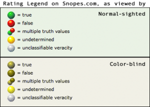 So I was disappointed to learn that you willingly diminish your site’s user experience using red-yellow-green “traffic light” indicators after being informed of the method’s shortcomings (waxy.org). Nearly 7% of males have a form of color blindness that makes it hard to distinguish between your true-or-false indicators. Your FAQ states that you know this, but you stick with the method anyway. You defend your decision with uninformed, flawed assumptions.
The color indicator problem is familiar to professionals in the data visualization arena — and so we use easily-implemented alternatives to side-step the whole issue. The following suggestions will work for your color-blind viewers, as well as normal-sighted people that print out your pages on a non-color printer.