The Evolution of (FileMaker) Charting, Part 1a

For this article I have taken a different approach, and offer up my current perspective on events in the history of data visualization and the FileMaker platform. Naturally, our viewpoints are formed by our direct experiences, but the passage of time also affects our interpretation. The other things that happen leading up to and following a point in time can alter the context — and meaning — of that moment.

Steve Jobs shared an example of this in his 2005 Stanford University commencement speech. He told the story of how his taking a calligraphy class as a college “drop-in” created his bias towards the first Mac having rich typography. He pointed out how everything is connected — but that we really never know how, until later.

So in this spirit and from the perspective of mid-2011 (text edited), please enjoy my retrospective wanderings.

~ Lee Lukehart

IN THE BEGINNING, there was data.

The first area chart, by William Playfair

Of course I’m referring to data in the times B.C. (Before Computing) — circa 1800 and earlier, before Charles Babbage invented the mechanical difference engine. This event begat teletype tape, punchcards, dot matrix line printers, and monstrously laborious plotters such as the CalComp pen plotter I commanded in college with Fortran IV. Its output looked like string art — colored thread strung between nails (often on black velvet) — a fad that was still popular at the time. Coincidence?

Contrast that image with the very first published line and area graphs, in 1786. Their creator, Scottish engineer William Playfair, also invented and published the first bar graph and pie chart within five years of one other. Those were heady times for paper and pen, printing press and engraver. One year after Playfair’s graphs debuted, a Dr. E.A.W. Zimmerman introduced the word “statistik” to the civilized world. And the first true topographical map was drawn by Marcellin du Carla-Boniface in that same 10-year period. Heady times indeed.

So why the fuss over events that happened more than 200 years ago?

Read More

Message to Snopes.com: “About Your Rating Symbols”

[Note: This is the text of a message I sent to the Snopes.com owners, seconding a valid user request per the blog post at waxy.org which itself was a critique on a Netflix chart. These are but two examples of reducing efficacy through poor display choices.]

David and Barbara, thank you so much for your efforts and diligence over the years with Snopes.com. The Internet is a better place as a result. I have directed hundreds of people to your site as a tool for fighting ignorance. I encourage folks to not believe everything they read, and to make at least the minimal effort of checking Snopes.com before they forward their erroneous (or even malevolent) message.

SnopesLegend_comparison
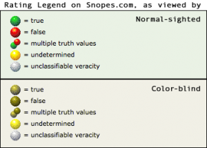
So I was disappointed to learn that you willingly diminish your site’s user experience using red-yellow-green “traffic light” indicators after being informed of the method’s shortcomings (waxy.org). Nearly 7% of males have a form of color blindness that makes it hard to distinguish between your true-or-false indicators. Your FAQ states that you know this, but you stick with the method anyway. You defend your decision with uninformed, flawed assumptions.

The color indicator problem is familiar to professionals in the data visualization arena — and so we use easily-implemented alternatives to side-step the whole issue. The following suggestions will work for your color-blind viewers, as well as normal-sighted people that print out your pages on a non-color printer.

Read More

Fun with FileMaker Pro 11 Charts, v1.5

Knowing how to represent data visually often draws upon quite varied skills. A data visualist ideally possesses some of the traits of information architect, graphic designer, mathematician, statistician, web designer, teacher, user interface designer, cognitive psychologist, and storyteller. One could argue that these skills are essential to thriving in our future information-rich society. Until the future arrives, however, we must manage with whatever we have. And one thing we now have is FileMaker Pro 11 Charts! Charting is the feature that will drive a new stage of success.

The demo file explores using the chart object in new ways…

Read More

FileMaker Go (Charting?!) on the iPad

Charting with FileMaker Go on the iPad[ Update Note: As of Oct 7, 2010 the demo file links return an updated v2 file that was released at DevCon in August. This was discussed in a subsequent blog post, Charting in FileMaker Go for iPad — what’s new in v2 (ChartingWithWebTech.fp7). ]

Web technologies have added functionality to FileMaker solutions since the Web Viewer layout object was introduced in version 8.5. The web viewer has proven especially useful for displaying Flash-generated charts from FusionCharts, Maani, AnyChart, and others.

FileMaker Pro v11 introduced a built-in chart layout object with 5 basic chart types. Charts suddenly became much easier to implement in FileMaker Pro!

However, with FileMaker Go for iPad and Phone (separate apps) built-in charting is not supported and Apple’s iOS doesn’t run Adobe Flash. Sure, you can load static images from the Google charts API into a web viewer — but what is really needed is an interactive and self-sufficient (as in no internet connection required) charting solution.

Luckily, the potential of

Read More

Bar Charts on Steroids

The bullet graph is a horizontal bar chart on steroids. This device was invented in 2005 by Stephen Few of Perceptual Edge, as a response to dashboard widgets that take lots of screen space to provide one piece of information.

By contrast, the bullet graph can efficiently convey quantitative data such as goal & percent attainment, as well as qualitative measures such as how good or bad a score of “85” really is. The unusual aspect to this is

Read More